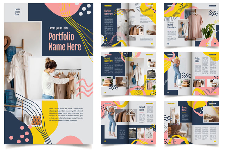
Brochure Design
Crafting Effective Brochure Designs: A Guide to Captivating Communication
Brochures remain a versatile and impactful tool in marketing and communication strategies. They serve as tangible representations of a brand, product, or service, providing essential information in a visually appealing format. Effective brochure design is crucial in engaging and informing the target audience effectively. Here’s a comprehensive guide with key pointers to master the art of brochure design:
- Define Purpose and Audience:
Before diving into design elements, it’s essential to define the brochure’s purpose and target audience. Whether it’s promoting a new product, showcasing services, or providing event details, clarity on these aspects shapes the entire design process.
- Structure and Layout:
A well-structured layout ensures information flows logically and intuitively. Decide on the type of fold (bi-fold, tri-fold, gate-fold) based on content volume and hierarchy. Each panel should have a clear purpose – cover for impact, inside for details, and back for contact information or call to action.
- Visual Hierarchy and Balance:
Visual hierarchy guides the reader’s eye through the brochure, emphasizing key messages and information. Use size, color, and typography strategically to differentiate headlines, subheadings, and body text. Achieve balance by distributing elements evenly across the page for a harmonious composition.
- Compelling Imagery and Graphics:
Images and graphics enhance visual appeal and convey messages effectively. High-quality photographs, illustrations, and icons should align with the brand’s aesthetic and resonate with the audience. Ensure they complement the text and reinforce the brochure’s theme and message.
- Typography and Readability:
Typography influences readability and reinforces brand personality. Choose fonts that are legible in print and appropriate for the target audience. Use a maximum of two to three font styles to maintain consistency and hierarchy throughout the brochure.
- Color Scheme and Branding:
Colors evoke emotions and play a pivotal role in branding. Select a color scheme that aligns with the brand’s identity and message. Maintain consistency with the brand’s primary colors while incorporating complementary shades to create visual interest.
- Clear and Concise Content:
Concise copywriting is essential to maintain reader engagement. Use clear, jargon-free language to convey information effectively. Highlight key benefits and unique selling points to capture attention and compel action.
- Call to Action (CTA):
Every effective brochure design includes a compelling call to action. Whether it’s visiting a website, contacting for more information, or making a purchase, the CTA should be clear, persuasive, and prominently displayed.
- Print Quality and Finish:
The tactile experience of a brochure can leave a lasting impression. Ensure print quality is high-resolution and colors are accurate. Consider finishes like matte or gloss to enhance durability and visual appeal.
- Feedback and Iteration:
Solicit feedback from stakeholders or target audience members to refine the design. Conduct usability tests to gauge effectiveness and make necessary adjustments before finalizing the brochure for distribution.
- Distribution and Tracking:
Plan how and where the brochures will be distributed – at events, in-store displays, or mailed directly. Use tracking methods like QR codes or unique URLs to measure engagement and effectiveness.
In conclusion, mastering brochure design requires a strategic blend of creativity, visual communication, and understanding of target audience preferences. By following these pointers, designers can create compelling brochures that not only inform but also engage and inspire action, ultimately contributing to the success of marketing and communication campaigns.
